
Segments
Layout Segment is the most essential part of the Layout. Segments display a specific type of data, depending on its type. Every Segment can be individually positioned and styled.
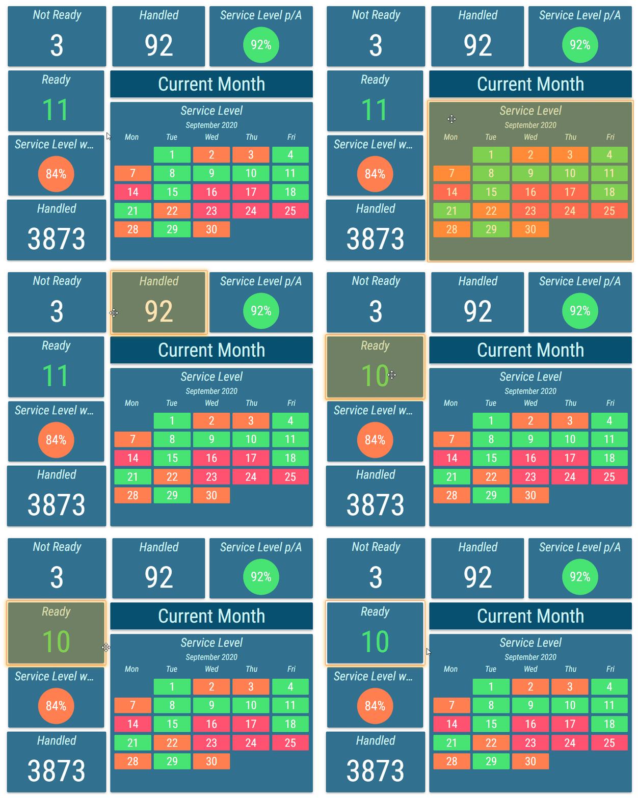
Options of a Segment can be accessed also by clicking on a segment in the Layout preview. A selected Segment is highlighted in the Layout preview with an orange glow.
Figure 1: Selected segment
Type
Required
Determines what type of data is displayed by the Segment.After the type of a Segment is selected, a second section is displayed. This section contains all options related to the selected type. Title
Title of the Segment used in the Layout preview and also in the Segment list.Visibility
On Demand visibility is available only for Nested Widget segment type.
Determines whether the Segment is visible in the Layout preview.Always - Segment is always visible.
Never - Segment is never visible.
On Demand - Segment is visible only when requested by another segment. Currently, only a Grid segment can trigger this — when it has a configured tooltip pointing to this Nested Widget and the user hovers over the corresponding Grid row.
The Never and On Demand visibility modes are only applied in Viewer Mode or Preview Mode. In the default Editor mode, these settings are not applied and all segments remain visible. Appearance
The style of the Segment.Corner Radius
Inheritable
Corner radius of the segment can be adjusted with a slider or a text field for a custom value. Measured in permilles of the entire Layout’s height.Margin
Inheritable
Margin of the segment can be adjusted with a slider or a text field for a custom value. Measured in permilles of the entire Layout’s height.Shadow
Inheritable
For more information see Shadow Style section.
Shadow of the segment.Transparency
Inheritable
Transparency of the segment, measured in percents, can be adjusted with a slider or a text field for a custom value.Borders
Inheritable
For more information see Borders Style section.
The style, width, and color settings for the segments borders.
Data Source
A data source to be used as a source for dynamically assigned values to properties.After selecting data source row filters can be set. They are used to determine a specific row from the Grid Data Source that should be used. Available row filters are defined by configured parent data filters on layout grid data source. For more information about parent data filter see Parent Data Filters chapter. For more information about row filters see Condition chapter. Create Instance Per Row
When enabled, a separate segment instance is created for each row returned by the assigned Grid Data Source.For this feature to work correctly:
The data source selected in the Data Source group of the Layout segment must match the one configured in the Calculation group of the associated segment type. Therefore, only segment types that support Grid Data Sources are compatible with this feature.
Dynamic Positioning must be enabled in the Position and Size group of the Layout segment. Without it, all instances are placed at the same position and overlap.All instances are managed under their parent segment and cannot be configured, resized, or moved independently. Each instance inherits the properties and static positioning logic defined on the parent segment.
When this setting is enabled, row filters cannot be set in the Data Source group. Any required filtering of grid values must be configured in the layout data source. Maximum Number of Instances
Not available if “Create Instance Per Row” is disabled
Maximum number of segment instances that can be created when Create Instance Per Row is enabled.
Position and Size
Coordinates and size of the segment. Segments don’t have to be fully contained in the Layout. That means that not every coordinate field needs to contain a value between 0 and 100 or be in the range of snapping points.
If multiple Segments are overlapping, the order is determined by their order in the segments list. This order can be manually changed by dragging an item in the list or changing Z-Index property.
Figure 2: Segments overlapping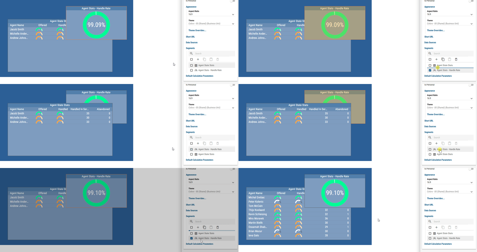
Top
Top boundary of the segment.
Can be dynamically assigned. For more information see Dynamic Value Fields section.
Measured in percents of the Layout’s size and/or number of snapping pointsLeft
Left boundary of the segment.
Can be dynamically assigned. For more information see Dynamic Value Fields section.
Measured in percents of the Layout’s size and/or number of snapping pointsHeight
Height of the segment.
Can be dynamically assigned. For more information see Dynamic Value Fields section.
Measured in percents of the Layout’s size and/or number of snapping points.Width
Width of the segment.
Can be dynamically assigned. For more information see Dynamic Value Fields section.
Measured in percents of the Layout’s size and/or number of snapping points.Rotation
Rotation of the segment.
Can be dynamically assigned. For more information see Dynamic Value Fields section.
Measured in degrees.Z-Index
Overlaying order of each Segment. Higher Z-Index value means the Segment is more on top, while a lower value means it is more towards the bottom.
Can be dynamically assigned. For more information see Dynamic Value Fields section.Lock Aspect Ratio
Whether aspect ratio of the source should be locked. For Image source, aspect ratio is locked by default. For Nested Layout and Nested Widget, aspect ratio is locked by default only in case if the parent Layout/Widget has aspect ratio different than UNLOCKED.Native Aspect Ratio
Available only for “Image”, “Nested Layout” and “Nested Widget” sources.
Native aspect ratio of the source. This is only informative field. Native aspect ratio can be restored by clicking on the “Restore Native Aspect Ratio” button.
Title
Settings for the title.Visibility
Inheritable
Whether the title should be visible.Show - Title is visible.
Hide - Title is hidden.
Position
Inheritable
Position of the title. If Float on Top or Float on Bottom is selected, title floats over the segment which may cause overlapping.Float on Top - Title floats over the segment on Top.
Float on Bottom - Title floats over the segment on Bottom.
Top - Title is displayed on the top of the segment.
Bottom - Title is displayed on the bottom of the segment.
Height
Inheritable
Height of the title that is measured in permilles of the entire Layout’s height.Text Color
Inheritable
For more information see Color Field section.
Color of the text.Background Color
Inheritable
For more information see Color Field section.
Color of the background.Text Style
Inheritable
For more information see Text Style section.
Type of font to use and whether bold or italic text should be used.Font Size Coefficient
Inheritable
The font size is calculated by multiplying available height for the text by font size coefficient.Horizontal Alignment
Inheritable
Position of the text on horizontal axis.Left - Text is aligned to the left.
Center - Text is aligned to the center.
Right - Text is aligned to the right.
Padding
Available only when “Left” or “Right” is selected as horizontal alignment.
Inheritable
The size of a padding between the Title text and Title’s border in “em” units. 1 em equals to the font size of the associated text.
The padding is applied to the side where the text is horizontally aligned.Enable Hyperlink
Whether the title should be clickable and trigger configured action.
Hyperlinks are not clickable in edit mode. Target Layout
Whether clicking on the title should open a specific Layout.Layout
Available only when “Target Layout” is enabled
The Layout that should be opened when the title is clicked.Query String Parameters
Available only when “Target Layout” is enabled
Parameters that will be added to the targeted layouts URL. Parameters are used for passing values to dynamic filters in grid-like sources. For more information about dynamic filters and URL parameters, see Filtering using URL parameters chapter.Name
Name of the query string parameter.Value
Value of the parameter.
Uri
Not available if “Target Layout” is enabled
Defines a Uniform Resource Identifier (URI) that determines the action triggered upon clicking. Users can specify:Webpage URLs (e.g., “https://example.com”) to open specific websites.
Email addresses (e.g., “mailto:example@mail.com”) to compose an email using the default mail client.
Phone numbers (e.g., “tel:0123456”) to initiate a phone call on compatible devices.
Custom URIs (e.g., “im:John Smith”) for instant messaging, which opens the default messaging app to send a message.
Target
Defines where the hyperlink should be opened:New Tab: Opens the specified URI in a new browser tab.
Current Tab: Loads the URI in the current browser tab, replacing the current content.
Pop-up: Displays the URI content in a new pop-up window.
None: Disables any specific target behavior, allowing the browser’s default action. This option should probably be used when provided Uri is email addresses, phone number or custom URI.
Paging Info
Settings for the paging info.Visibility
Inheritable
Whether the paging info should be visible.Show - Paging info is visible.
Hide - Paging info is hidden.
Position
Inheritable
Position of the paging info. If Float on Top or Float on Bottom is selected, paging info floats over the segment which may cause overlapping.Float on Top - Paging info floats over the segment on Top.
Float on Bottom - Paging info floats over the segment on Bottom.
Top - Paging info is displayed on the top of the segment.
Bottom - Paging info is displayed on the bottom of the segment.
Height
Inheritable
Height of the paging info that is measured in permilles of the entire Layout’s height.Text Color
Inheritable
For more information see Color Field section.
Color of the text.Background Color
Inheritable
For more information see Color Field section.
Color of the background.Text Style
Inheritable
For more information see Text Style section.
Type of font to use and whether bold or italic text should be used.Font Size Coefficient
Inheritable
The font size is calculated by multiplying available height for the text by font size coefficient.Horizontal Alignment
Inheritable
Position of the text on horizontal axis.Left - Text is aligned to the left.
Center - Text is aligned to the center.
Right - Text is aligned to the right.
Padding
Available only when “Left” or “Right” is selected as horizontal alignment.
Inheritable
The size of a padding between the paging info content and paging info’s border in “em” units. 1 em equals to the font size of the associated text.
The padding is applied to the side where the text is horizontally aligned.