What is a Bar/Line Chart - Grid
A Bar/Line Chart - Grid can display values of one or more calculations. This way, development of multiple calculations can be compared with each other.
Multiple series with various Bar/Line types and modes can be configured. A legend can be displayed that describes the calculation and can provide additional information. The position and size of the legend can be configured.
Figure 1: Bar/Line Chart - Grid
Values for the specific time can be also displayed by hovering over a series. This way, the user can see the exact value of the calculation at a specific time.
Figure 2: Bar/Line Chart - Grid - Tooltip
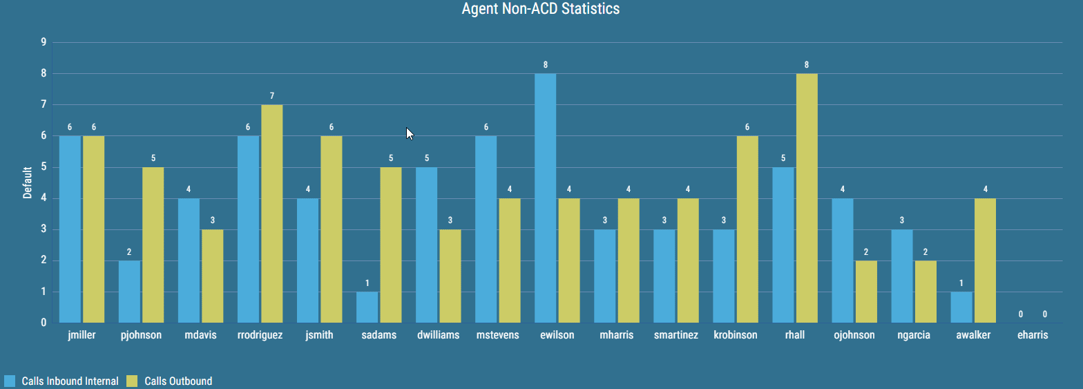
A Bar/Line Chart - Grid consists of one horizontal axis and any number of vertical axes. The horizontal axis can be configured by selecting a specific column. Results are represented by vertical axes. Each axis can display grid lines.
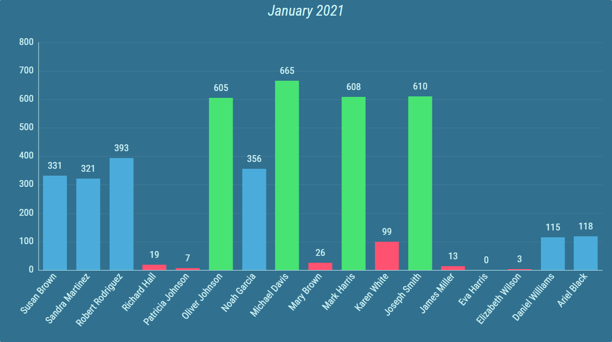
There are multiple ways the results can be presented.
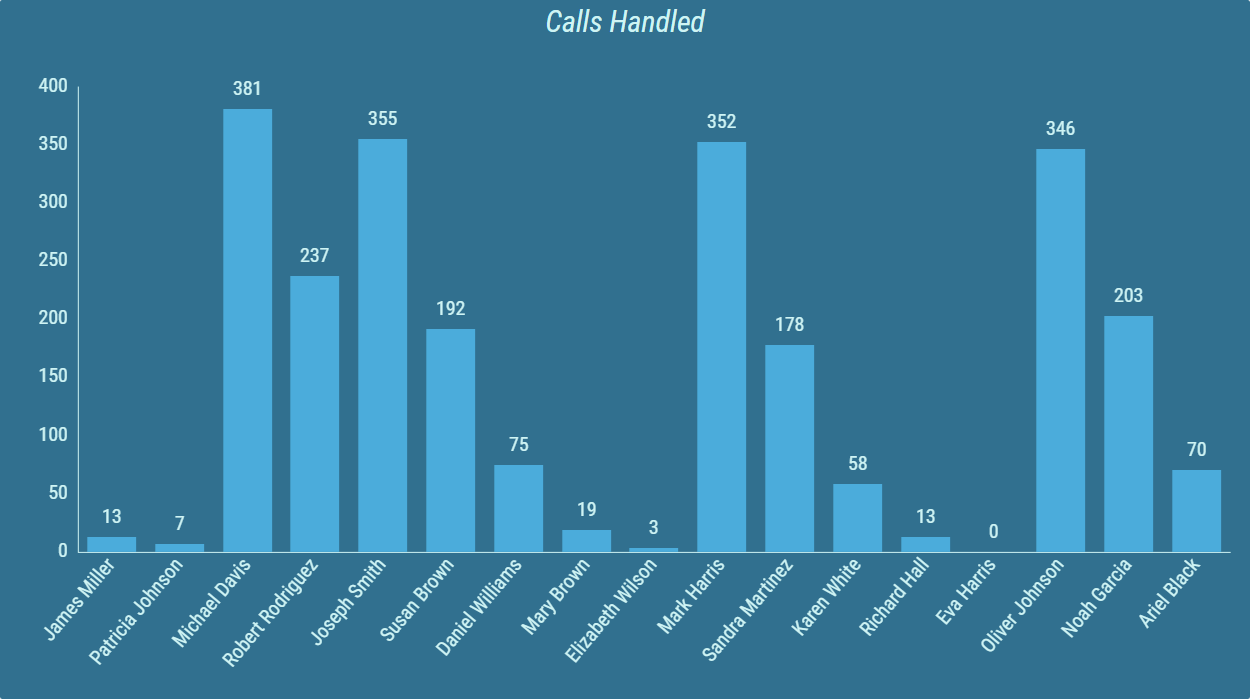
Figure 3: Two calculations with Bar types
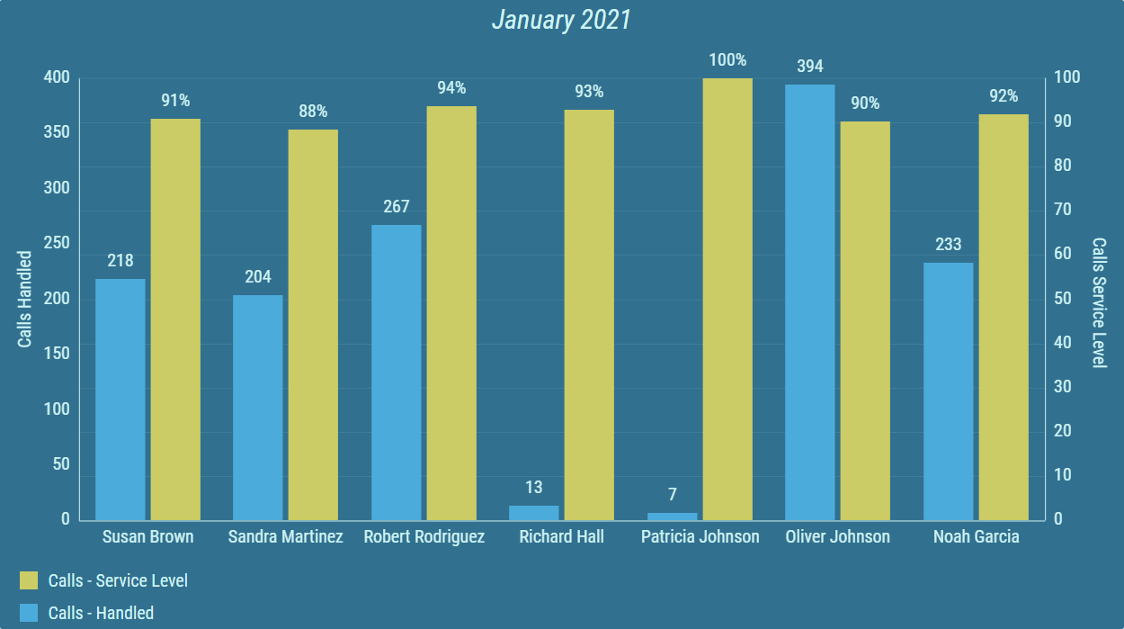
Grid consisting of calculations with a Bar type set can also be configured with horizontal value axis orientation.
Figure 4: Horizontal value axis orientation
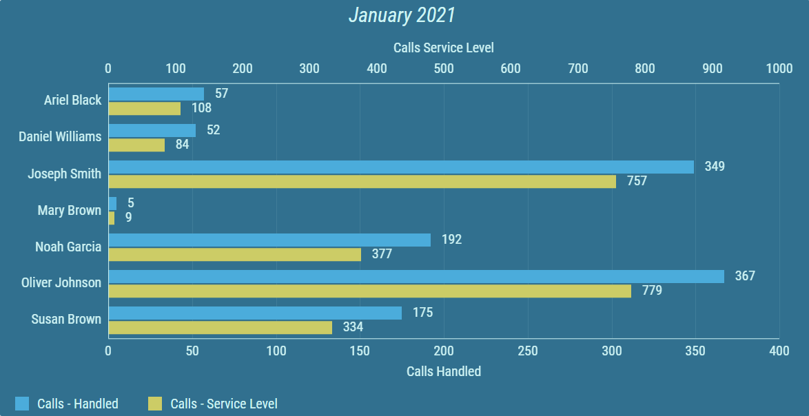
Figure 5: Line type (blue) and Curved Line type (yellow), with vertical grid lines enabled
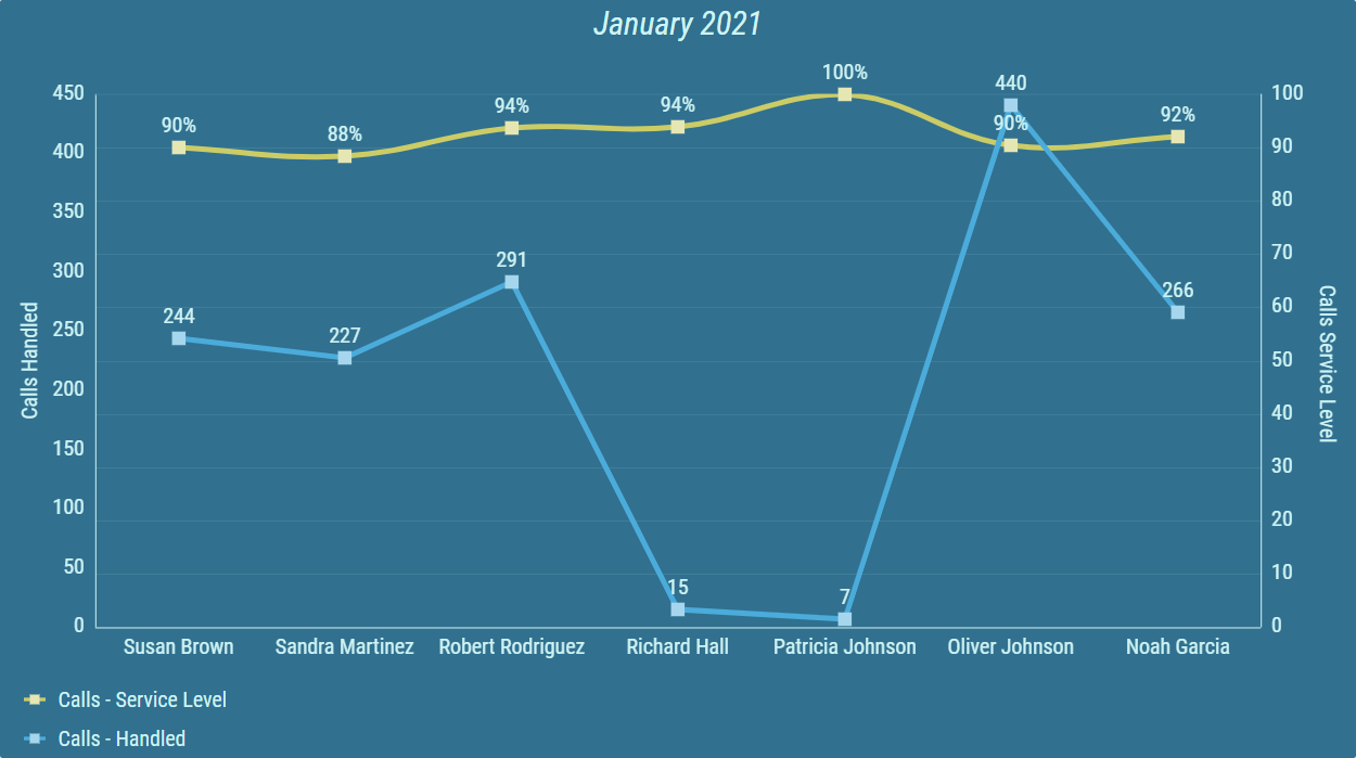
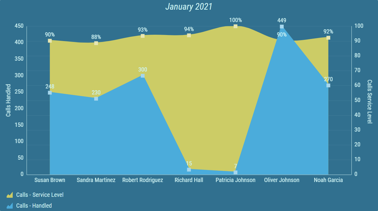
Figure 6: Line Area type (blue) and Curved Line Area type (yellow), with vertical grid lines enabled
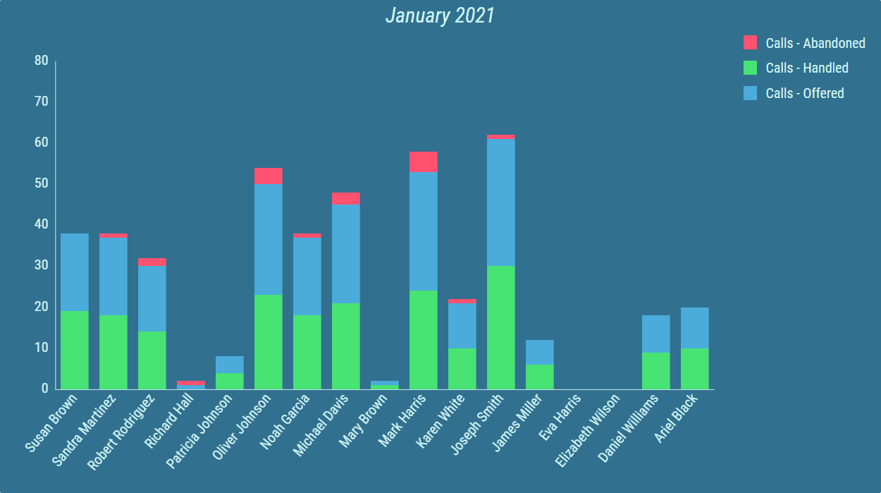
Sometimes, multiple calculations provide similar results that need to be displayed together. Results of such calculations can be stacked into one value.
Figure 7: Timeline Chart with three stacked calculations
Conditional styles can be configured for each calculation. Results are colored according to range result values falls under. This allows the user to easily see if the requirements for a specific agent were not met, or highlight exceptional results.
Figure 8: Timeline Chart with conditional styles and threshold segments color mode.
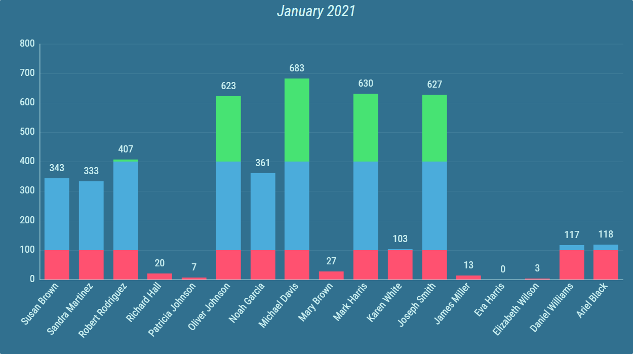
Figure 9: Timeline Chart with conditional styles and whole bar color mode.
For more information about editing this segment, see Bar/Line Chart - Grid chapter.