What is a Bar/Line Chart - KPI Timeline
A Bar/Line Chart - KPI Timeline displays results of one or more calculations over the course of a configured period. This way, the development of multiple calculations can be compared with each other.
A day, week, month or year periods can be displayed. Furthermore, several such periods can be displayed at once. A legend can be displayed, that describes the calculation and can provide additional information. The position and size of the legend can be configured.
Figure 1: Bar/Line Chart - KPI Timeline
Values for the specific series can also be displayed by hovering over the chart. This way, the user can see the exact value of the calculation for a specific day.
Figure 2: Pie Chart - Tooltip
A Bar/Line Chart - KPI Timeline consists of one horizontal axis and any number of vertical axes. The horizontal axis represents the configured period. The axis is split into items, each item representing a part of the period, for example, a day. Results are represented by vertical axes. Each axis can display grid lines.
There are multiple ways the results can be presented.
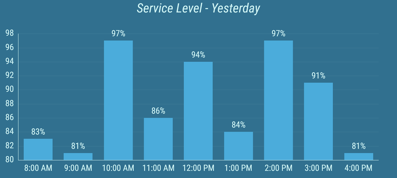
Figure 3: Two calculations with Bar types
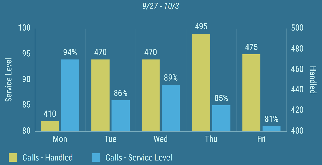
Figure 4: Line type (blue) and Curved Line type (yellow), with vertical grid lines enabled
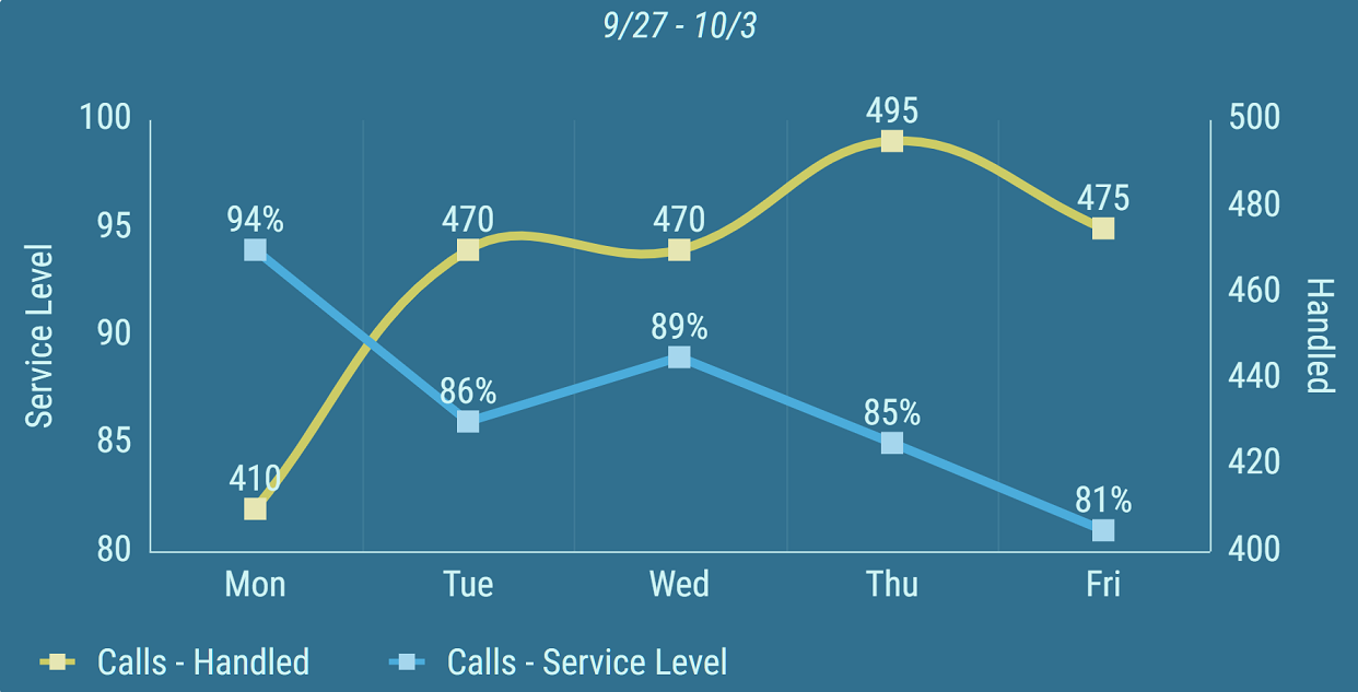
Figure 5: Line Area type (blue) and Curved Line Area type (yellow), with vertical grid lines enabled
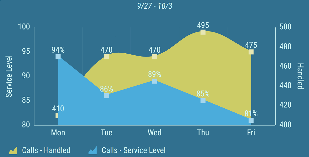
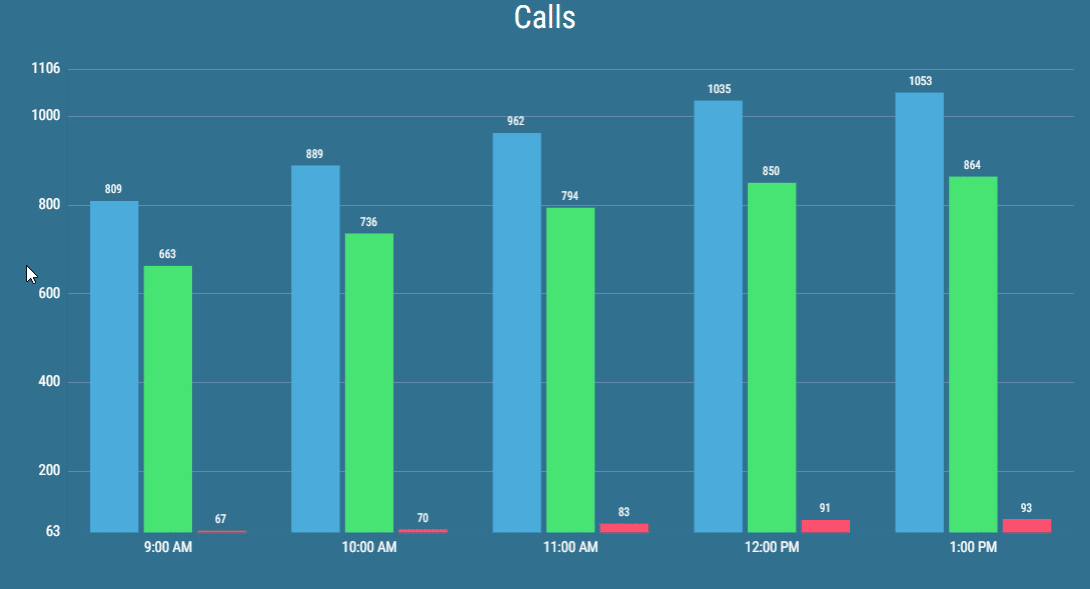
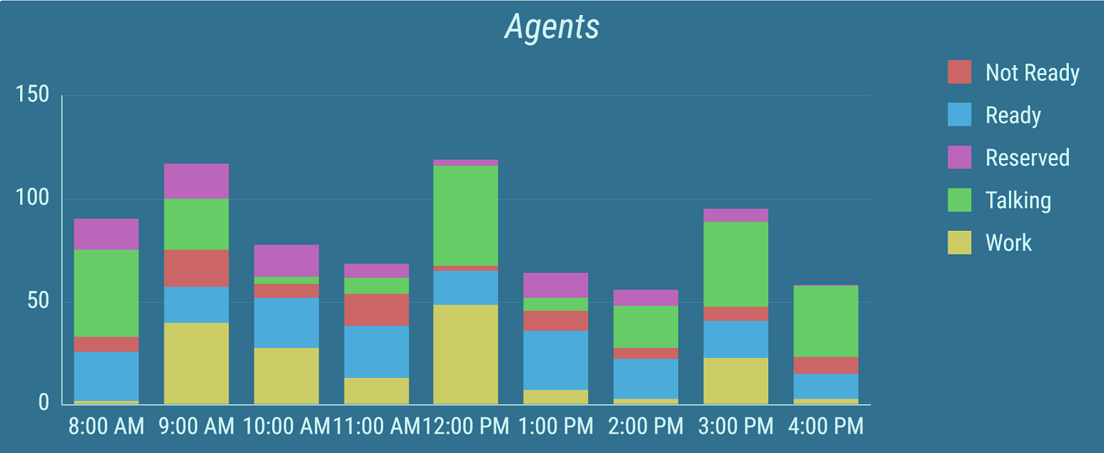
Sometimes, multiple calculations provide similar results that need to be displayed together. Results of such calculations can be stacked into one value.
Figure 6: Timeline Chart with two stacked calculations
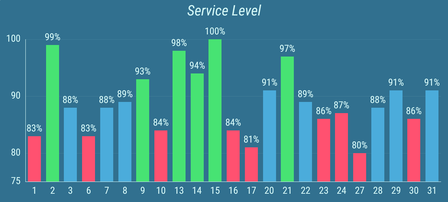
Conditional Styles can be configured for each calculation. Results are colored according to the condition that the result met. This allows the user to easily see when the requirements for a specific day were not met or highlight exceptional results.
Figure 7: Timeline Chart with conditional styles.
For more information about editing this segment, see Bar/Line Chart - Kpi Timeline chapter.