What is a Pie Chart
A Pie Chart displays results of several calculations in the form of a circular chart. Usually, a Pie Chart is used to display the current result of its calculations. However, historical results can be displayed too. A year, month, week, day, hour, 30 minutes, or 15 minutes historical interval can be chosen. When displaying a historical result, how much the interval should go back in time can be configured. This way Pie Chart can display values from any number of days ago. For more information about historical intervals see Historical Intervals.
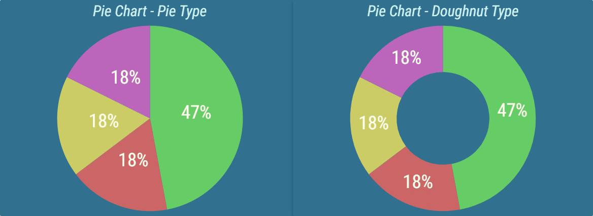
Figure 1: Pie Chart types
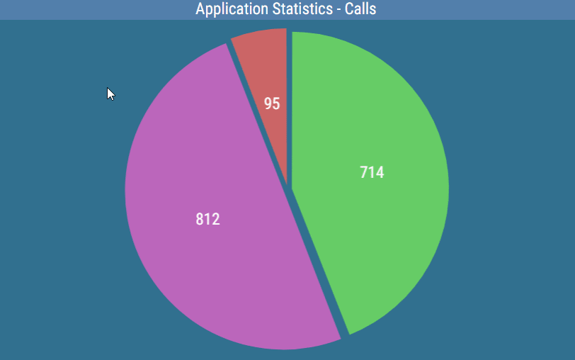
Values for the specific segment can also be displayed by hovering over it in a pie chart.
Figure 2: Pie Chart - Tooltip
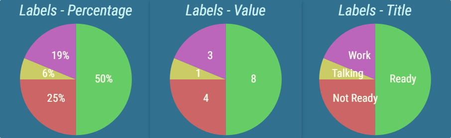
Each calculation displayed in the chart is represented by a color. A corresponding section of the chart is reserved for each calculation. The size of each section is proportionate to all other sections, effectively comparing the calculation results. Each section can be accompanied by a label, which represents the name of the calculation, actual result, or percentage of the entire chart that the section takes.
Figure 3: Pie Charts with different label configurations
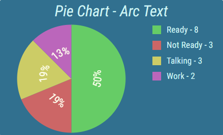
The appearance and position of this label can be configured. For example, labels can be written in arc, for better usage of available space.
Figure 4: Pie Charts with label in arc
A legend can be displayed that describes the calculation and can provide additional information. The position and size of the legend can be configured.
Figure 5: Pie Chart with legend enabled

For more information about editing this segment, see Pie Chart.