Themes
Themes are used to define a default style for each type of segment in particular Business Unit. Themes are reusable and can be applied to any number of Layouts, thus saving time when multiple Layouts should look the same. This makes styling easy by changing everything in one central location.
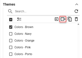
Themes can be exported into a zip file by clicking the export button.
Figure 1: Export button
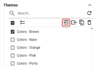
Exported theme can be imported in the DW by clicking the import button.
Figure 2: Import button
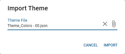
Locate the exported zip file and select, how the static content, used within the theme, should be imported. Available options are:
Import And Rename If Exists
static content files are imported. In case a file with the same name already exists, the imported file is renamed.Import And Replace If Exists
static content files are imported. In case a file with the same name already exists, it is replaced by the imported file.Import If Not Exists
static content files are only imported if they do not already exist.
Figure 3: Import dialog
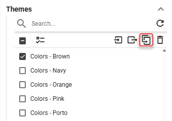
To duplicate a Theme, click the Duplicate button located above the list of themes.
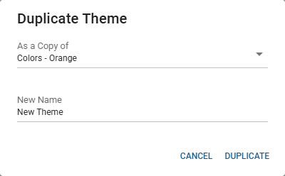
In the following dialog, select an existing theme, from which the new theme will be created and provide the name for the new theme. Click the button to create a new theme based on the selected one.
Name
The name of a theme.Background Type
Type of the Layout’s background.Background Color
For more information see Color field section.
Color of the Layout’s background.Background Image
Image of the Layout’s background.
Layout Segment
Corner Radius
Corner radius of the segment measured in permilles of the entire Layout’s height.Margin
Margin of the ticker measured in permilles of the entire Layout’s height.Shadow
For more information see Shadow Style section.
Shadow of the segment.Transparency
Transparency of layout segments measured in percents.Borders
For more information see Borders Style section.
The style, width and color settings for the segments borders.Title
Settings applied to source titles.Visibility
Whether the title should be visible.Show - Title is visible.
Hide - Title is hidden.
Position
Position of the title. If Float on Top or Float on Bottom is selected, title floats over the segment which may cause overlapping.Float on Top - Title floats over the segment on Top.
Float on Bottom - Title floats over the segment on Bottom.
Top - Title is displayed on the top of the segment.
Bottom - Title is displayed on the bottom of the segment.
Height
Height of segment titles.Text Color
For more information see Color field section.
The color of title text.Background Color
For more information see Color field section.
The color of the title background.Text Style
For more information see Text Style section.
Type of font to use and whether bold or italic text should be used.Font Size Coefficient
The font size is calculated by multiplying available height for the text by font size coefficient.
Ticker Items aren’t affected by this option.Horizontal Alignment
Controls, where the text should be aligned on the horizontal axis.Left - Text is aligned to the left.
Center - Text is centered.
Right - Text is aligned to the right.
Padding
The size of a padding between the segment’s title and segment’s border in “em” units. 1 em equals to the font size of the associated text.
The padding is applied to the side where the text is horizontally aligned.
Paging Info
Settings for the paging info.Visibility
Whether the paging info should be visible.Show - Paging info is visible.
Hide - Paging info is hidden.
Position
Position of the paging info. If Float on Top or Float on Bottom is selected, paging info floats over the segment which may cause overlapping.Float on Top - Paging info floats over the segment on Top.
Float on Bottom - Paging info floats over the segment on Bottom.
Top - Paging info is displayed on the top of the segment.
Bottom - Paging info is displayed on the bottom of the segment.
Height
Height of the paging info that is measured in permilles of the entire Layout’s height.Text Color
For more information see Color field section.
Color of the text.Background Color
For more information see Color field section.
Color of the background.Text Style
For more information see Text Style section.
Type of font to use and whether bold or italic text should be used.Font Size Coefficient
The font size is calculated by multiplying available height for the text by font size coefficient.Horizontal Alignment
Position of the text on horizontal axis.Left - Text is aligned to the left.
Center - Text is aligned to the center.
Right - Text is aligned to the right.
Padding
The size of a padding between the paging info content and paging info’s border in “em” units. 1 em equals to the font size of the associated text.
The padding is applied to the side where the content is horizontally aligned.
Bar/Line Chart
Plot Area Margin
Setting for an amount of empty space between top of the chart and header. In case of horizontal value axis orientation, plot area margin defines an amount of empty space between the end of the chart (maximum value on the horizontal axis) and other entity such as the legend. If there is no other entity, this setting defines the space between the end of the chart and the segment’s border.Headers
The style of headers.Text Color
For more information see Color field section.
The color of header’s text.Background Color
For more information see Color field section.
The background color used in the headersText Style
For more information see Text Style section.
Type of font to use and whether bold or italic text should be used.Font Size Coefficient
The font size is calculated by multiplying available height for the text by font size coefficient.Height
Height of headers.
Colors
The color settings used in a timeline chart.Text
For more information see Color field section.
The color of a text.Background
For more information see Color field section.
The color of a background.Plot Area Background
For more information see Color field section.
The color of a plot area background.Axes
For more information see Color field section.
The color of an axes lines.Grid Lines
For more information see Color field section.
The color of a grid lines.
Legend
The style of legend in the bar/line chart.Text Color
For more information see Color field section.
Color of the text.Background Color
For more information see Color field section.
The background color of the legend.Text Style
For more information see Text Style section.
Type of font to use and whether bold or italic text should be used.Font Size
The size of the labels. Measured in permilles of the entire Layout’s height.Font Size Coefficient
The font size is calculated by multiplying available height for the text by font size coefficient.
Tooltips
Settings for tooltips.Title Color
For more information see Color field section.
Color of the tooltip title.Text Color
For more information see Color field section.
Color of the text.Background Color
For more information see Color field section.
The background color of the legend.Border Color
For more information see Color field section.
The color of the tooltip border.Border Width
The width of the tooltip border.Square Marker Border Color
For more information see Color field section.
A border color of a square associated with the series.
Label Axis
Settings for label axis.Text Style
For more information see Text Style section.
Label axis does not support Custom CSS in the Text Style. If Theme Text Style, with Custom CSS is chosen, Custom CSS will not be applied
Type of font to use and whether bold or italic text should be used.Font Size
The size of a label axis font. Measured in permilles of the entire Layout’s height.Font Size Coefficient
The font size is calculated by multiplying available height for the text by font size coefficient.
Value Axis
Settings for value axis.Title
Settings for value axis titles.Text Style
For more information see Text Style section.
Value axis does not support Custom CSS in the Text Style. If Theme Text Style, with Custom CSS is chosen, Custom CSS will not be applied
Type of font to use and whether bold or italic text should be used.Font Size
The size of a text. Measured in permilles of the entire Layout’s height.Font Size Coefficient
The font size is calculated by multiplying available height for the text by font size coefficient.
Labels
Settings for value axis labels.Text Style
For more information see Text Style section.
Labels do not support Custom CSS in the Text Style. If Theme Text Style, with Custom CSS is chosen, Custom CSS will not be applied
Type of font to use and whether bold or italic text should be used.Font Size
The size of a text. Measured in permilles of the entire Layout’s height.Font Size Coefficient
The font size is calculated by multiplying available height for the text by font size coefficient.
Thresholds
Settings for thresholds.Line Style
For more information see Borders Style section.
The style, width and color of the line.Labels
Settings for thresholds labels.Text Style
For more information see Text Style section..
Type of font to use and whether bold, italic or underlined text should be used.Position
Position of the label.Left - Text is aligned to the left.
Center - Text is centered.
Right - Text is aligned to the right.
Text Color
For more information see Color field section..
Color of the text.Background Color
For more information see Color field section..
Color of the background.Font Size
Size of the font. Measured in permilles of the entire Layout’s height.Font Size Coefficient
The font size is calculated by multiplying available height for the text by font size coefficient.
Series
Settings for series.Line Width
Width of a line when values in series are presented as line, curved line, line area or curved line area. Measured in permilles of the entire Layout’s height.Colors
The color settings of chart series.Value
For more information see Color field section.
Color of the value.
Value Labels
Settings of value labels.Text Color
For more information see Color field section.
Value labels do not support Custom CSS in the Text Style. If Theme Text Style, with Custom CSS is chosen, Custom CSS will not be applied
The color of text used in value labels.Text Style
For more information see Text Style section.
Type of font to use and whether bold or italic text should be used.Font Size
The size of a text. Measured in permilles of the entire Layout’s height.Font Size Coefficient
The font size is calculated by multiplying available height for the text by font size coefficient.Custom Null Value
A custom value that is displayed when the value is null.
Calendar
Show Day Headers
By turning off, hide name of days from calendar.Show Period Headers
By turning off, hide header describing shown interval.Background Color
For more information see Color field section.
The color of the background.Headers
The style of the headers in the calendar.Text Color
For more information see Color field section.
The color of the headers text.Background Color
For more information see Color field section.
The color of headers background.Text Style
For more information see Text Style section.
Type of font to use and whether bold or italic text should be used.Font Size Coefficient
The font size is calculated by multiplying available height for the text by font size coefficient.Height
Height of the calendar headers.
Day Numbers
Visual configuration of day numbers.Visibility
Whether day numbers should be visible.Content
Content of the day numbers.Title - Title is displayed.
Paging Info - Paging info is displayed.
Title and Paging Info - Both title and paging info are displayed.
Position
Position of the day numbers. If Float on Top or Float on Bottom is selected, day numbers float over the segment which may cause overlapping.Float on Top - Title floats over the segment on Top.
Float on Bottom - Title floats over the segment on Bottom.
Top - Title is displayed on the top of the segment.
Bottom - Title is displayed on the bottom of the segment.
Horizontal Alignment
Position of day numbers on horizontal axis.Left - Text is aligned to the left.
Center - Text is centered.
Right - Text is aligned to the right.
Padding
The size of a padding between the day numbers and day numbers’s border in “em” units. 1 em equals to the font size of the associated text.
The padding is applied to the side where the text is horizontally aligned.Height
Height of day numbers.Text Color
For more information see Color field section.
The color of the day number, displayed in the tile.Background Color
For more information see Color field section.
Color of the day numbers background.Text Style
For more information see Text Style section.
Type of font to use and whether bold or italic text should be used.Font Size Coefficient
The font size is calculated by multiplying available height for the text by font size coefficient.
Values
Settings for calendar values.Background Color
For more information see Color field section.
The color of values background.Best Fit
Whether value should dynamically resize to best fit into a clock.Text Style
For more information see Text Style section.
Type of font to use and whether bold or italic text should be used.Horizontal Alignment
Position of the text on horizontal axis.Left - Text is aligned to the left.
Center - Text is centered.
Right - Text is aligned to the right.
Padding
The size of a padding between the text and values border in “em” units. 1 em equals to the font size of the associated text.
The padding is applied to the side where the text is horizontally aligned.Custom Null Value
A custom value that is displayed when the value is null.Corner Radius
Corner radius of the values measured in permilles of the entire Layout’s height.Presentation Types
Settings for each presentation type.Alphanumeric
Color settings for Alphanumeric presentation type.Text Color
For more information see Color field section.
Color of the text.Font Size Coefficient
The font size is calculated by multiplying available height for the text by font size coefficient.
Semaphore
Color settings for Semaphore presentation type.Text Color
For more information see Color field section.
Color of the text.Semaphore Color
For more information see Color field section.
Color of the semaphore.Font Size Coefficient
The font size is calculated by multiplying available height for the text by font size coefficient. In the case of semicircle, circle and semaphore presentation type combined with the regular sizing, available height is defined by the height of the circle/semicircle/semaphore. Otherwise, by the height of the container.
Circle
Color settings for Circle presentation type.Text Color
For more information see Color field section.
Color of the text.Circle Color
For more information see Color field section.
Color of the circle.Font Size Coefficient
The font size is calculated by multiplying available height for the text by font size coefficient. In the case of semicircle, circle and semaphore presentation type combined with the regular sizing, available height is defined by the height of the circle/semicircle/semaphore. Otherwise, by the height of the container.
Semi Circle
Color settings for Semi Circle presentation type.Text Color
For more information see Color field section.
Color of the text.Semi Circle Color
For more information see Color field section.
Color of the Semi Circle.Font Size Coefficient
The font size is calculated by multiplying available height for the text by font size coefficient. In the case of semicircle, circle and semaphore presentation type combined with the regular sizing, available height is defined by the height of the circle/semicircle/semaphore. Otherwise, by the height of the container.
Horizontal Bar
Color settings for Horizontal Bar presentation type.Text Color
For more information see Color field section.
Color of the text.Horizontal Bar Color
For more information see Color field section.
Color of the Horizontal Bar.Empty Bar Color
For more information see Color field section.
Background color of the bar itself.Font Size Coefficient
The font size is calculated by multiplying available height for the text by font size coefficient.
Vertical Bar
Color settings for Vertical Bar presentation type.Text Color
For more information see Color field section.
Color of the text.Vertical Bar Color
For more information see Color field section.
Color of the Vertical Bar.Empty Bar Color
For more information see Color field section.
Background color of the bar itself.Font Size Coefficient
The font size is calculated by multiplying available height for the text by font size coefficient.
Clock
Format
Format of displayed time. For more information about supported formats see Clock chapter in layout viewer and editor guide.Style
The style of a Clock.Text Color
For more information see Color field section.
The color of the text.Background Color
For more information see Color field section.
The color of background.Text Style
For more information see Text Style section.
Type of font to use and whether bold or italic text should be used.Font Size Coefficient
The font size is calculated by multiplying available height for the text by font size coefficient.Best Fit
Whether value should dynamically resize to best fit into a clock.Horizontal Alignment
Controls, where the text should be aligned on the horizontal axis.Left - Text is aligned to the left.
Center - Text is centered.
Right - Text is aligned to the right.
Vertical Alignment
Controls, where the text should be aligned on the vertical axis.Top - Text is aligned to the top.
Middle - Text is centered.
Bottom - Text is aligned to the bottom.
Padding
The size of a padding between the text and clock’s border in “em” units. 1 em equals to the font size of the associated text.
The padding is applied to the side where the text is horizontally aligned.
Grid
Paging Interval
The time interval between change of each page.Sizing Mode
Row size mode.Number of Rows - Number of rows displayed for each page.
Height of Row - Height of a row measured in permilles of the entire Layout’s height.
Row Height
Height of a row measured in permilles of the entire Layout’s height.Page Size
Number of rows displayed for each page.Automatically Start Paging
Whether paging should start automatically.Horizontal Alignment
Controls, where the text should be aligned on the horizontal axis.Left - Text is aligned to the left.
Center - Text is centered.
Right - Text is aligned to the right.
Padding
The size of a padding between the text and cell’s border in “em” units. 1 em equals to the font size of the associated text.
The padding is applied to the side where the text is horizontally aligned.Headers
The style of the headers in the grid.Text Color
For more information see Color field section.
The color of header’s textBackground Color
For more information see Color field section.
The color of header’s background.Text Style
For more information see Text Style section.
Type of font to use and whether bold or italic text should be used.Height
Height of the headers.Font Size Coefficient
The font size is calculated by multiplying available height for the text by font size coefficient.Borders
For more information see Borders Style section.
The style, width and color settings for the header borders.
Values
Settings for values in grid.Background Color
For more information see Color field section.
Color of the background.Alternate Row Colors
Whether consecutive rows should alternate colors.Alternate Row Background Color
For more information see Color field section.
Alternating color of the background.Text Style
For more information see Text Style section.
Type of font to use and whether bold or italic text should be used.Best Fit
Whether value should dynamically resize to best fit into a grid.Custom Null Value
A custom value that is displayed when the value is null.Presentation Types
Color settings for each presentation type.Alphanumeric
Color settings for Alphanumeric presentation type.Text Color
For more information see Color field section.
Color of the text.Alternate Row Text Color
For more information see Color field section.
Alternating color of the text.Font Size Coefficient
The font size is calculated by multiplying available height for the text by font size coefficient.
Semaphore
Color settings for Semaphore presentation type.Text Color
For more information see Color field section.
Color of the text.Alternate Row Text Color
For more information see Color field section.
Alternating color of the text.Semaphore Color
For more information see Color field section.
Color of the semaphore.Alternate Row Semaphore Color
For more information see Color field section.
Alternating color of the semaphore.Font Size Coefficient
The font size is calculated by multiplying available height for the text by font size coefficient. In the case of semicircle, circle and semaphore presentation type combined with the regular sizing, available height is defined by the height of the circle/semicircle/semaphore. Otherwise, by the height of the container.
Circle
Color settings for Circle presentation type.Text Color
For more information see Color field section.
Color of the text.Alternate Row Text Color
For more information see Color field section.
Alternating color of the text.Circle Color
For more information see Color field section.
Color of the circle.Alternate Row Circle Color
For more information see Color field section.
Alternating color of the circle.Font Size Coefficient
The font size is calculated by multiplying available height for the text by font size coefficient. In the case of semicircle, circle and semaphore presentation type combined with the regular sizing, available height is defined by the height of the circle/semicircle/semaphore. Otherwise, by the height of the container.
Semi Circle
Color settings for Semi Circle presentation type.Text Color
For more information see Color field section.
Color of the text.Alternate Row Text Color
For more information see Color field section.
Alternating color of the text.Semi Circle Color
For more information see Color field section.
Color of the Semi Circle.Alternate Row Semi Circle Color
For more information see Color field section.
Alternating color of the semi circle.Font Size Coefficient
The font size is calculated by multiplying available height for the text by font size coefficient. In the case of semicircle, circle and semaphore presentation type combined with the regular sizing, available height is defined by the height of the circle/semicircle/semaphore. Otherwise, by the height of the container.
Horizontal Bar
Color settings for Horizontal Bar presentation type.Text Color
For more information see Color field section.
Color of the text.Alternate Row Text Color
For more information see Color field section.
Alternating color of the text.Horizontal Bar Color
For more information see Color field section.
Color of the Horizontal Bar.Alternate Row Horizontal Bar Color
For more information see Color field section.
Alternating color of the horizontal bar.Empty Bar Color
For more information see Color field section.
Background color of the bar itself.Alternate Empty Bar Color
For more information see Color field section.
Alternate background color of the bar itself.Font Size Coefficient
The font size is calculated by multiplying available height for the text by font size coefficient.
Vertical Bar
Color settings for Vertical Bar presentation type.Text Color
For more information see Color field section.
Color of the text.Alternate Row Text Color
For more information see Color field section.
Alternating color of the text.Vertical Bar Color
For more information see Color field section.
Color of the Vertical Bar.Alternate Row Vertical Bar Color
For more information see Color field section.
Alternating color of the vertical bar.Empty Bar Color
For more information see Color field section.
Background color of the bar itself.Alternate Empty Bar Color
For more information see Color field section.
Alternate background color of the bar itself.Font Size Coefficient
The font size is calculated by multiplying available height for the text by font size coefficient.
Borders
For more information see Borders Style section.
The style, width and color settings for the borders in a values area.
Totals
Totals display the aggregation of the values from the whole column in the separated row on the bottom of the grid. Colors and text style in this row can be configured independently of the others.Text Color
For more information see Color field section.
Color of the text.Background Color
For more information see Color field section.
Color of the background.Text Style
For more information see Text Style section.
Type of font to use and whether bold or italic text should be used.Font Size Coefficient
The font size is calculated by multiplying available height for the text by font size coefficient.Borders
For more information see Borders Style section.
The style, width and color settings for the borders in a totals row.
Background Blink Color
The background color can alternate between this color and the standard color.Color
For more information see Color field section.
A color to alternate.
Audible Alert
Settings for audible alerts.Audio File
The alert sound that will be played.Repeat
Whether an audio file will repeat itself until a value is out of the set range.
Image
Background Color
For more information see Color field section.
The color of image’s background
KPI
Background Color
For more information see Color field section.
The color of KPI’s background.Best Fit
Dynamically resize a value to best fit into a KPI.Text Style
For more information see Text Style section.
Type of font to use and whether bold or italic text should be used.Horizontal Alignment
Controls, where the text should be aligned on the horizontal axis.Left - Text is aligned to the left.
Center - Text is centered.
Right - Text is aligned to the right.
Padding
The size of a padding between the value and segment’s border in “em” units. 1 em equals to the font size of the associated text.
The padding is applied to the side where the text is horizontally aligned.Custom Null Value
A custom value that is displayed when the value is null.Presentation Types
Color settings for each presentation type.Alphanumeric
Color settings for Alphanumeric presentation type.Text Color
For more information see Color field section.
Color of the text.Font Size Coefficient
The font size is calculated by multiplying available height for the text by font size coefficient.
Semaphore
Color settings for Semaphore presentation type.Text Color
For more information see Color field section.
Color of the text.Semaphore Color
For more information see Color field section.
Color of the semaphore.Font Size Coefficient
The font size is calculated by multiplying available height for the text by font size coefficient. In the case of semicircle, circle and semaphore presentation type combined with the regular sizing, available height is defined by the height of the circle/semicircle/semaphore. Otherwise, by the height of the container.
Circle
Color settings for Circle presentation type.Text Color
For more information see Color field section.
Color of the text.Circle Color
For more information see Color field section.
Color of the circle.Font Size Coefficient
The font size is calculated by multiplying available height for the text by font size coefficient. In the case of semicircle, circle and semaphore presentation type combined with the regular sizing, available height is defined by the height of the circle/semicircle/semaphore. Otherwise, by the height of the container.
Semi Circle
Color settings for Semi Circle presentation type.Text Color
For more information see Color field section.
Color of the text.Semi Circle Color
For more information see Color field section.
Color of the Semi Circle.Font Size Coefficient
The font size is calculated by multiplying available height for the text by font size coefficient. In the case of semicircle, circle and semaphore presentation type combined with the regular sizing, available height is defined by the height of the circle/semicircle/semaphore. Otherwise, by the height of the container.
Horizontal Bar
Color settings for Horizontal Bar presentation type.Text Color
For more information see Color field section.
Color of the text.Horizontal Bar Color
For more information see Color field section.
Color of the Horizontal Bar.Empty Bar Color
For more information see Color field section.
Background color of the bar itself.Font Size Coefficient
The font size is calculated by multiplying available height for the text by font size coefficient.
Vertical Bar
Color settings for Vertical Bar presentation type.Text Color
For more information see Color field section.
Color of the text.Vertical Bar Color
For more information see Color field section.
Color of the Vertical Bar.Empty Bar Color
For more information see Color field section.
Background color of the bar itself.Font Size Coefficient
The font size is calculated by multiplying available height for the text by font size coefficient.
Background Blink Color
The background color can alternate between this color and the standard color.Color
For more information see Color field section.
A color to alternate.
Audible Alert
Settings for audible alerts.Audio File
The alert sound that will be played.Repeat
Whether an audio file will repeat itself until a value is out of the set range.
Label
Text Color
For more information see Color field section.
Color of the text.Background Color
For more information see Color field section.
The color of Label’s background.Text Style
For more information see Text Style section.
Type of font to use and whether bold or italic text should be used.Font Size Coefficient
The font size is calculated by multiplying available height for the text by font size coefficient.Horizontal Alignment
Controls, where the text should be aligned on the horizontal axis.Left - Text is aligned to the left.
Center - Text is centered.
Right - Text is aligned to the right.
Vertical Alignment
Controls, where the text should be aligned on the vertical axis.Top - Text is aligned to the top.
Middle - Text is centered.
Bottom - Text is aligned to the bottom.
Padding
The size of a padding between the text and Label’s border in “em” units. 1 em equals to the font size of the associated text.
The padding is applied to the side where the text is horizontally aligned.
Nested Layout/Widget
Background Type
Type of the Layout’s/Widget’s background.Image - Layout’s/Widget’s background is an image.
Solid Color - Layout’s/Widget’s background is a solid color.
Background Color
For more information see Color field section.
Color of the Layout’s/Widget’s background.Background Image
Image of the Layout’s/Widget’s background.
PDF Document
Automatically Start Paging
Whether paging should start automatically.Background Color
For more information see Color field section.
The background color used in the PDF document.
Pie Chart
Background Color
For more information see Color field section.
The background color of the pie chart.Segment Background Color Palette
Currently applicable only to Pie Chart - Grid segment
A palette of colors used to color the background of each pie segment. Colors are assigned sequentially based on segment order. Once all palette colors are exhausted, the cycle repeats from the first color.Error Color
For more information see Color field section.
Color of the validation error in case of all values in pie chart being “0”.Segment Labels
The settings for segment labels.Label Color
For more information see Color field section.
Color of the segment labels.Text Style
For more information see Text Style section.
Type of font to use and whether bold or italic text should be used.Font Size
The size of the segment labels. Measured in permilles of the entire Layout’s height.Font Size Coefficient
The font size is calculated by multiplying available height for the text by font size coefficient.
Legend
The style of legend in the pie chart.Text Color
For more information see Color field section.
Color of the text.Background Color
For more information see Color field section.
Background color of a legend.Text Style
For more information see Text Style section.
Type of font to use and whether bold or italic text should be used.Font Size
The size of the labels. Measured in permilles of the entire Layout’s height.Font Size Coefficient
The font size is calculated by multiplying available height for the text by font size coefficient.Custom Null Value
A custom value that is displayed when the value is null.
Tooltips
Settings for tooltips.Title Color
For more information see Color field section.
Color of the tooltip title.Text Color
For more information see Color field section.
Color of the text.Background Color
For more information see Color field section.
The background color of the legend.Border Color
For more information see Color field section.
The color of the tooltip border.Border Width
The width of the tooltip border.Square Marker Border Color
For more information see Color field section.
A border color of a square associated with the segment.
Sequence
Corner Radius
Corner radius of the sequence’s item measured in permilles of the entire Layout’s height.Margin
Margin of the sequence’s item measured in permilles of the entire Layout’s height.Shadow
For more information see Shadow Style section.
Shadow of the sequence’s item.Horizontal Alignment
Applicable only for Item types that support Aspect Ratio locking (Image, Nested Layout, Nested Widget)
Controls, where the sequence item should be aligned on the horizontal axis.Left - Item is aligned to the left.
Center - Item is centered.
Right - Item is aligned to the right.
Vertical Alignment
Applicable only for Item types that support Aspect Ratio locking (Image, Nested Layout, Nested Widget)
Controls, where the sequence item should be aligned on the vertical axis.Top - Item is aligned to the top.
Middle - Item is centered vertically.
Bottom - Item is aligned to the bottom.
Automatically Start Paging
Whether paging should start automatically.Title
Settings applied to source titles.Visibility
Whether the title should be visible.Show - Title is visible.
Hide - Title is hidden.
Position
Position of the title. If Float on Top or Float on Bottom is selected, title floats over the segment which may cause overlapping.Float on Top - Title floats over the segment on Top.
Float on Bottom - Title floats over the segment on Bottom.
Top - Title is displayed on the top of the segment.
Bottom - Title is displayed on the bottom of the segment.
Height
Height of segment titles.Text Color
For more information see Color field section.
The color of title text.Background Color
For more information see Color field section.
The color of the title background.Text Style
For more information see Text Style section.
Type of font to use and whether bold or italic text should be used.Font Size Coefficient
The font size is calculated by multiplying available height for the text by font size coefficient.
Ticker Items aren’t affected by this option.Horizontal Alignment
Controls, where the text should be aligned on the horizontal axis.Left - Text is aligned to the left.
Center - Text is centered.
Right - Text is aligned to the right.
Padding
The size of a padding between the segment’s title and segment’s border in “em” units. 1 em equals to the font size of the associated text.
The padding is applied to the side where the text is horizontally aligned.
Paging Info
Settings for the paging info.Visibility
Whether the paging info should be visible.Show - Paging info is visible.
Hide - Paging info is hidden.
Position
Position of the paging info. If Float on Top or Float on Bottom is selected, paging info floats over the segment which may cause overlapping.Float on Top - Paging info floats over the segment on Top.
Float on Bottom - Paging info floats over the segment on Bottom.
Top - Paging info is displayed on the top of the segment.
Bottom - Paging info is displayed on the bottom of the segment.
Height
Height of the paging info that is measured in permilles of the entire Layout’s height.Text Color
For more information see Color field section.
Color of the text.Background Color
For more information see Color field section.
Color of the background.Text Style
For more information see Text Style section.
Type of font to use and whether bold or italic text should be used.Font Size Coefficient
The font size is calculated by multiplying available height for the text by font size coefficient.Horizontal Alignment
Position of the text on horizontal axis.Left - Text is aligned to the left.
Center - Text is aligned to the center.
Right - Text is aligned to the right.
Padding
The size of a padding between the paging info content and paging info’s border in “em” units. 1 em equals to the font size of the associated text.
The padding is applied to the side where the content is horizontally aligned.
Shape
Background Color
For more information see Color field section.
The background color of the Shape.
Ticker
Background Color
For more information see Color field section.
The background color of the ticker.Corner Radius
Corner radius of the ticker’s item measured in permilles of the entire Layout’s height.Margin
Margin of the ticker’s item measured in permilles of the entire Layout’s height.Shadow
For more information see Shadow Style section.
Shadow of the ticker’s item.Title
Settings applied to source titles.Visibility
Whether the title should be visible.Show - Title is visible.
Hide - Title is hidden.
Position
Position of the title. If Float on Top or Float on Bottom is selected, title floats over the ticker which may cause overlapping.Float on Top - Title floats over the segment on Top.
Float on Bottom - Title floats over the segment on Bottom.
Top - Title is displayed on the top of the segment.
Bottom - Title is displayed on the bottom of the segment.
Height
Height of ticker items titles.Text Color
For more information see Color field section.
The color of title text.Background Color
For more information see Color field section.
The color of the title background.Text Style
For more information see Text Style section.
Type of font to use and whether bold or italic text should be used.Font Size Coefficient
The font size is calculated by multiplying available height for the text by font size coefficient.
Ticker Items aren’t affected by this option.Horizontal Alignment
Controls, where the text should be aligned on the horizontal axis.Left - Text is aligned to the left.
Center - Text is centered.
Right - Text is aligned to the right.
Padding
The size of a padding between the segment’s title and segment’s border in “em” units. 1 em equals to the font size of the associated text.
The padding is applied to the side where the text is horizontally aligned.
Web Page
Background Color
For more information see Color field section.
The color of the web page’s background.
Word Cloud
Text Style
For more information see Text Style section.
Word Cloud does not support Custom CSS in the Text Style. If Theme Text Style, with Custom CSS is chosen, Custom CSS will not be applied
Type of font to use and whether bold or italic text should be used.Spacing
A coefficient that indicates the amount of space between words.Out Of Bound Behavior
Dictates what should happen with the word if it exceeds the source boundaries.Hide - hides the word that exceeds the Word Cloud boundaries.
If there is any word hidden due to exceeding the Word Cloud boundaries, the user will be notified in a pop up. Pop up appears only during editing of layout. Shrink To Fit - reduces the size of a word that exceeds the Word Cloud boundaries to fit into them.
If there is a size reduction in any word due to exceeding the Word Cloud boundaries, the user will be notified in a pop up. Pop up appears only during editing of layout.
Word Sizing
Word size options.Size Parameter
Parameter on the basis of which the word size is calculated.Weight - the size of the word depends on the weight assigned to the word.
Weight Order - the size of the word is calculated on the basis of the order in which the word is dependent on the weight assigned to the word.
Minimum Font Size Coefficient
Minimum font size coefficient expresses relation of text size to height of the source. For example the value of 0.5 makes the header text half the size of the source. The font size will never drop below minimum size set.Maximum Font Size Coefficient
Maximum font size coefficient expresses relation of text size to height of the source. For example the value of 0.5 makes the text half the size of the source. The font size will never exceed the maximum size set.Sizing Function
The function by which the word size is calculated.Parabolic - differences in word size change parabolically, depending on the weight of the word.
Exponential - differences in word size change exponentialy, depending on the weight of the word. Differences in size of the words raises quicker than by using a parabolic function.
Parabolic Function Exponent
Exponent, according to which the word size is calculated. The higher the value, the greater the difference between word sizes.Exponential Function Base
A value, according to which the word size is calculated. The higher the value, the greater the difference between word sizes.
Word Rotation
Word rotation options.Minimum Rotation Angle
Minimum angle for word rotation in degrees. Word rotation will never be at a lower angle than a value set.Maximum Rotation Angle
Maximum angle for word rotation in degrees. Word rotation will never exceed this angle.Rotation Steps
The number of different angles of rotation of the word to be used.Rotate Probability
The probability of words rotation in percent.
Colors
Color options.Background Color
For more information see Color field section.
The color of the background.Text Color
For more information see Color field section.
A text color, used in the Fixed color mode.
YouTube Video
Volume
The volume of a selected video.
Text Styles
A Theme Text style is a predefined text style that defines the font to use and whether bold or italic text should be used. It can be reused in layouts within the theme in which it was defined.
Name
The name of a Theme Text style.Text Style
For more information see Text Style section.
Style of the text.
Color Palettes
A Theme Color Palette is a predefined set of colors that can be reused in layouts within the theme in which it was defined. Theme Color Palettes are typically used when multiple elements should use different colors while still keeping a consistent visual style.
Name
The name of a Theme Color Palette.Colors
For more information see Color field section.
A list of colors.
Color Palette Generation
You can generate a color palette automatically by clicking the Generate Colors button.
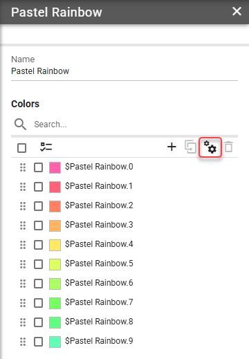
This opens a dialog where you can configure the palette generation:
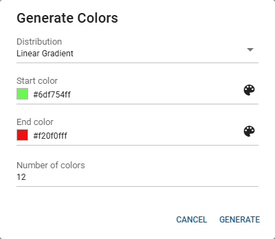
Distribution
The mode used to generate the palette from the base color.Hue Gradient - Generates colors by varying the hue while maintaining consistent saturation and lightness.
Lightness Gradient - Generates colors by varying the lightness from dark to light while maintaining the base hue.
Transparency Gradient - Generates colors with varying levels of transparency applied to the base color.
Linear Gradient - Generates colors by creating a linear interpolation between two colors.
Color
Required
Not available for linear gradient distribution mode.
The initial color from which the palette will be generated.Start Color
Required
Only available for linear gradient distribution mode.
The starting color of the gradient.End Color
Required
Only available for linear gradient distribution mode.
The ending color of the gradient.Number of Colors
Required
The number of colors to generate in the palette.
Colors
A Theme Color is a predefined color, that can be reused in layouts within the theme in which it was defined. Theme Colors are typically used to define the color of specific parts of a layout or segment that are used repeatedly, such as a title or header.
Name
The name of a Theme Color.Color
For more information see Color field section.
A color.