
What is a Pie Chart - Grid
A Pie Chart - Grid displays data from a Grid calculation in the form of a circular chart. Unlike the classic Pie Chart, where each slice corresponds to an individual scalar calculation, the Pie Chart - Grid uses a single Grid calculation as its source. Each row of the selected Grid calculation becomes one slice of the chart, with the slice size determined by the value in a chosen value column.
Figure 1: Pie Chart - Grid types
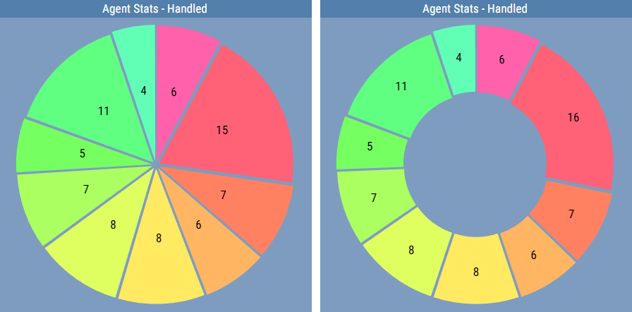
To configure the chart, a Grid calculation is set up and one of its columns is designated as the value column. The values in that column determine the proportional size of each slice. Row labels, typically taken from another column in the Grid calculation, are used to identify each slice.
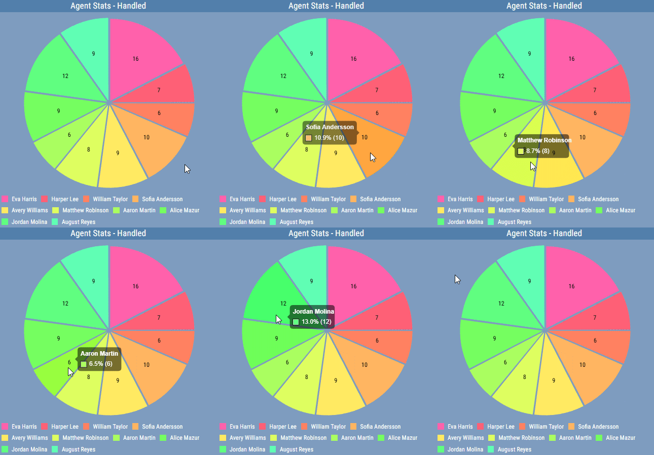
Values for a specific slice can also be displayed by hovering over it in the chart.
Figure 2: Pie Chart - Grid tooltip
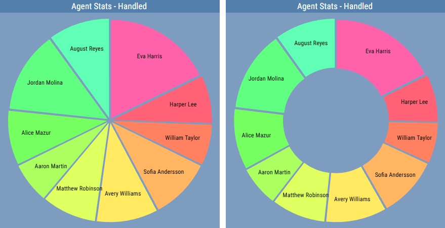
Each slice can be accompanied by a label, which can represent the row name, the actual value, or the percentage of the total that the slice represents. The appearance and position of the labels can be configured. Labels can also be written in arc for better use of available space.
Figure 3: Pie Chart - Grid with labels
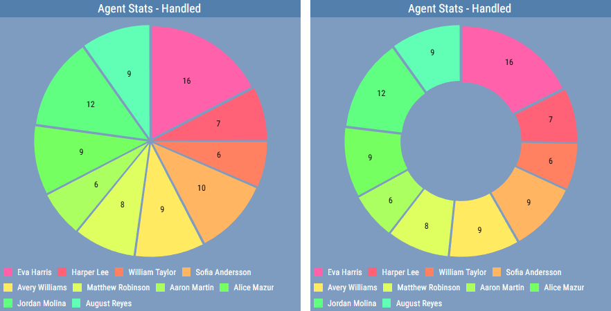
A legend can be displayed that describes each row and can provide additional information. The position and size of the legend can be configured.
Figure 4: Pie Chart - Grid with legend enabled
For more information about editing this segment, see Pie Chart - Grid.