Panels
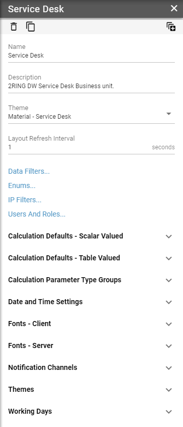
A panel is a vertical set of configuration options that typically describe a single record.
Figure 1: Panel
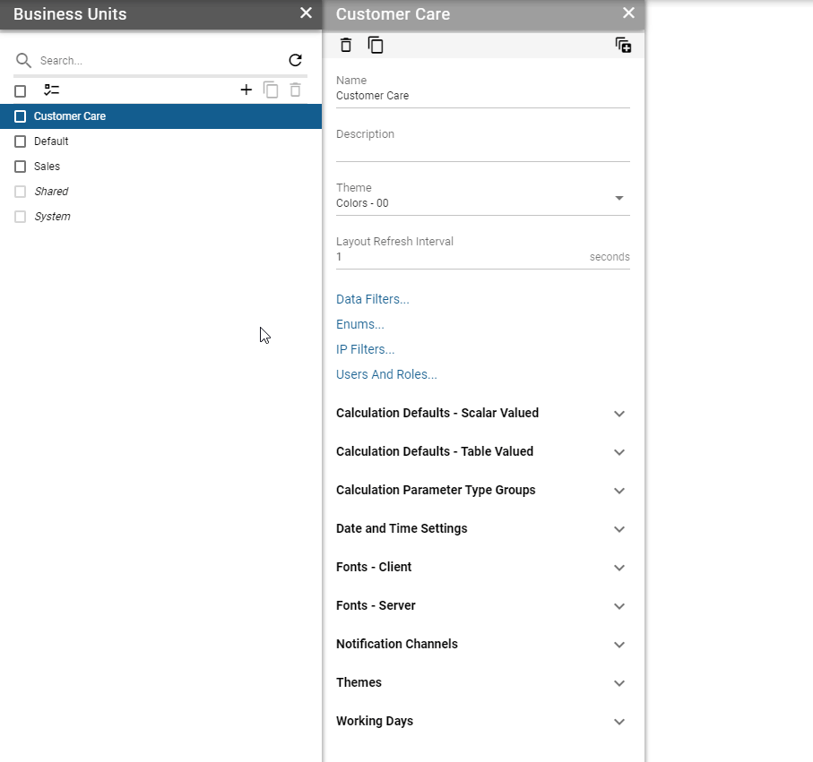
Width of each panel can be adjusted by clicking and dragging the right border of the panel.
Figure 2: Resizing panels
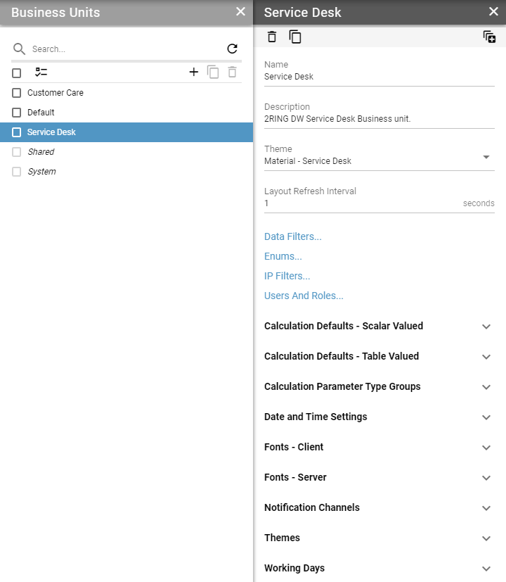
A panel may contain options, that navigate into another panel. For example, when a list item is clicked, a new panel is opened to the right, containing all of its options. A keyboard focus is always moved onto the newly opened panel. Header of a focused panel is colored in a darker shade than the rest of the panels. A panel can be closed by clicking the X button located on the right side of its header. When closing a panel, all child (opened to the right) panels are also closed.
Figure 3: Multiple opened panels
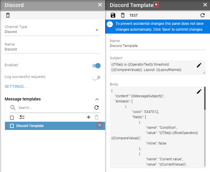
When a panel contains unsaved changes * is shown in its header.
Figure 4: Unsaved changes in panel
Panel’s toolbar
Most common buttons in toolbar:
Figure 5: Most Common Buttons
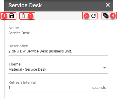
Save
Some panels do not save changes automatically. If this is the case, the panel toolbar will contain a save button.Delete
This button is visible if a record is deletable. Deleting a record requires user confirmation to avoid unintended deletes by misclick.Refresh
Refreshing a record requires user confirmation as all unsaved changes will be lost.Expand/collapse all groups
This button is visible only when the panel contains more than one group.