KPI
Related Videos
KPI presents a single value, that is the result of a calculation. The value can be configured to be displayed in multiple different ways and styles.
Some calculations types provide values that are calculated as an overall sum over a certain period. These calculations, also called cumulative, offer additional configuration options.
Calculation
For calculation options, see Editing Scalar Valued Calculations chapter.
The calculation options control, how the displayed values are calculated.Link to Data Source
Whether data source should be used for generating results.For available options when Data Source is not linked see chapter. Data Source
Available only when “Link to Data Source” is enabled
A data source to be used.After selecting data source of grid type row filters can be set. They are used to determine a specific row from the Grid Data Source that should be used. Available row filters are defined by configured parent data filters on layout grid data source. For more information about parent data filter see Data Filters. For more information about row filters see Condition. Column
Available only when Data Source is linked and Grid Data Source is selected
Additional info about items is shown on hover
Specifies a column from which the value should be displayed.Aggregation Function
Available only when Data Source is linked and Grid Data Source is selected
A method how to merge values, if multiple rows are returned.Average - available only for numeric values
Count
Count Not Null
Count Distinct
First
Last
Join Text - available only for text values
Max
Median - available only for numeric values
Min
Standard Deviation - available only for numeric values
Sum - available only for numeric values
Variance - available only for numeric values
Weighted Average - available only for numeric values
Weight Column
Available only when Data Source is linked and Grid Data Source is selected
Available only when “Weighted Average” is selected as an aggregation function.
Additional info about items is shown on hover
Name of the column that contains values that will be used as weight modifier while calculating average.Separator
Available only when Data Source is linked and Grid Data Source is selected
Available only when Text column is selected and “Join Text” is selected as an aggregation function.
A separator that is used to separate multiple text values while joining them.Notifications
For more information see Notifications chapter.
This group contains list of configured notifications.
Use Test Value
Test value is used to force the KPI to display a user-defined value. This can be helpful for example in case of testing a conditional styles.Value
A value to be displayed in the KPI.
Appearance
The style of a KPIPresentation Type
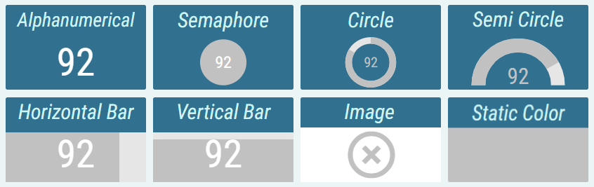
Defines how value should be presented.Alphanumeric - The value is presented as a pure text, without any additional graphical elements.
Semaphore - The value is enveloped in a colored circle. The circle changes color based on configured conditional styles. The semaphore is used, when the state is more important than the value itself.
Circle - The value is accompanied by a circle indicator. The indicator represents the level of fulfillment of a configured goal.
Semi Circle - The value is accompanied by a semi-circle indicator. The indicator represents the level of fulfillment of a configured goal.
Horizontal/Vertical Bar - The value is accompanied by a rectangular indicator. The indicator represents the level of fulfillment of a configured goal.
Image - An image is applied.
Static Color - A static color is applied.
Display Format
Format in which value should be displayed. When Raw is selected, the value is displayed without any transformation.Custom Display Format
Available only when “Custom” is selected as a Display Format
For more information see Custom Display Format section.
Custom format in which value should be displayed.Text Color
Inheritable
For more information see Color Field section.
Color of the text.Semaphore/Circle/Semi Circle/Bar Color
Inheritable
According to the selected presentation type
For more information see Color Field section.
Color of the Semaphore/Circle/Semi Circle/Bar.Empty Bar Color
Inheritable
Available only when “Horizontal/Vertical Bar” is selected as a presentation type
For more information see Color Field section.
Background color of the bar itself.Background Color
Inheritable
Not available, if the “Image” presentation type is selected
For more information see Color Field section.
Color of the background.Text Style
Inheritable
Not available, if the “Image” presentation type is selected
For more information see Text Style section.
Type of font to use and whether bold or italic text should be used.Text Sizing
Inheritable
Not available, if the “Image” or “Static color” presentation type is selected
Controls, how font size is calculated.Regular - Font is sized relatively to KPI’s height. In case of Circle, Semi Circle and Semaphore presentation type, font is sized relatively to Circle’s/Semi Circle’s/Semaphore’s height.
Best Fit - Font is dynamically sized to always fit inside KPI.
Font Size Coefficient
Inheritable
Available only when “Regular” is selected as a text sizing
Not available if “Image” or “Solid Color” is selected as a presentation type
The font size is calculated by multiplying available height for the text by font size coefficient. In the case of semicircle, circle, and semaphore presentation type combined with the regular sizing, available height is defined by the height of the circle/semicircle/semaphore. Otherwise, by the height of the container.Text Wrapping
Available only if “Regular” is selected as a text sizing.
Whether the text should be split into multiple lines if the text is wider than the whole segment.Preserve Whitespace
Available only if “Regular” is selected as a text sizing.
Whether whitespaces should be preserved as they are, or be replaced with a single space character.Enable Hyperlink
Whether the KPI should be clickable and trigger configured action.
Hyperlinks are not clickable in edit mode. Target Layout
Whether clicking on the value should open a specific Layout.Layout
Available only when “Target Layout” is enabled
The Layout that should be opened when the value is clicked.Query String Parameters
Available only when “Target Layout” is enabled
Parameters that will be added to the targeted layouts URL. Parameters are used for passing values to dynamic filters in grid-like sources. For more information about dynamic filters and URL parameters, see Filtering using URL parameters chapter.Name
Name of the query string parameter.Value
Value of the parameter. The {{value}} placeholder allows referencing the current value.
Text
Not available if “Image” presentation type is selected
Defines a text that will be displayed as a hyperlink instead of current value. {{value}} placeholder can be used to insert current value anywhere in the text. This placeholder is replaced with value that is formatted using configured display format at runtime. This setting allows users to customize the text for a more descriptive or interactive experience.Uri
Not available if “Target Layout” is enabled
Defines a Uniform Resource Identifier (URI) that determines the action triggered upon clicking. {{value}} placeholder can be used to insert current value anywhere in the text. This placeholder is replaced with value that is not formatted at runtime. Users can specify:Webpage URLs (e.g., “https://example.com”) to open specific websites.
Email addresses (e.g., “mailto:example@mail.com”) to compose an email using the default mail client.
Phone numbers (e.g., “tel:0123456”) to initiate a phone call on compatible devices.
Custom URIs (e.g., “im:John Smith”) for instant messaging, which opens the default messaging app to send a message.
Target
Defines where the hyperlink should be opened:New Tab: Opens the specified URI in a new browser tab.
Current Tab: Loads the URI in the current browser tab, replacing the current content.
Pop-up: Displays the URI content in a new pop-up window.
None: Disables any specific target behavior, allowing the browser’s default action. This option should probably be used when provided Uri is email addresses, phone number or custom URI.
Display Range Min/Max
Required
Available only when “Circle”, “Semi Circle” or “Bar” presentation type is selected.
Specifies the range of values, graphical indicators can display.Horizontal Alignment
Inheritable
Available only when the text sizing is set to “Regular” and presentation type to “Alphanumeric”.
Controls, where the value should be aligned on the horizontal axis.Left - The value is aligned to the left side of the segment.
Center - The value is aligned to the center of the segment.
Right - The value is aligned to the right side of the segment.
Padding
Inheritable
Available only when “Center” horizontal alignment is selected The size of a padding between the value and segment’s border in “em” units. 1 em equals the font size of the associated text.
The padding is applied to the side where the text is horizontally aligned.File
Available only when “Image” presentation type is selected
For more information see Static Content chapter.
Relative path of the image, that should be displayed. Using the {{value}} placeholder in the path, an image can dynamically change, based on the KPI value.Image Horizontal Alignment
Available only when “Image” presentation type is selected
Controls, where the image should be aligned on the horizontal axis.Left - The image is aligned to the left side of the segment.
Center - The image is aligned to the center of the segment.
Right - The image is aligned to the right side of the segment.
Image Vertical Alignment
Available only when “Image” presentation type is selected
Controls, where the image should be aligned on the vertical axis.Top - The image is aligned to the top of the segment.
Middle - The image is aligned to the middle of the segment.
Bottom - The image is aligned to the bottom of the segment.
Image Size
Available only when “Image” presentation type is selected
Decides, how the image is adjusted to the Segment’s size.Cover - The image is resized to cover the whole Segment, without deforming the image. No uncovered spaces are present. However, one of image’s axis may overlap outside of the Segment’s boundaries.
Contain - The image is resized to be fully displayed at the largest possible size without deforming the image. Uncovered spaces, filled with the Background Color, are present.
Fill - The image fully fills the entire Segment’s size. The image may be deformed. No uncovered spaces or overlapping occur.
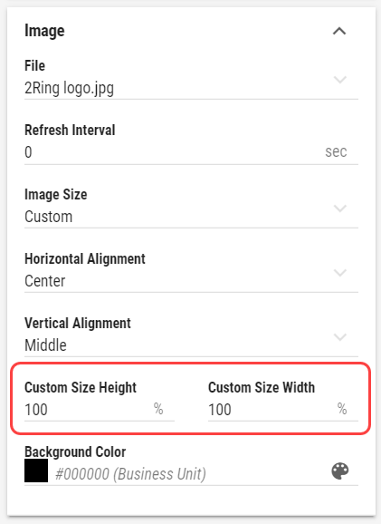
Custom - When selected, Custom Size Height and Custom Size Width fields are displayed. These fields define size of the image in percentages of the Segment’s size.
Effects and Filters
Available only when “Image” presentation type is selected
Controls, adjusting the image, such as Brightness, Contrast, Opacity, etc. Click to revert image to its default values.Custom Null Value
Inheritable
A custom value that is displayed when the value is null.Conditional Styles
Manually orderable
For more information see Conditional Styles chapter.
Conditional Styles are used to modify the appearance of the value based on its data.