Color field
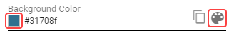
A special type of a Value field containing a color in HEX, RGB or string format. List of all supported color names is available here. A specific color name such as “red” or “blue” can also be used. Value can be copied by clicking the copy button that appears when you hover over the color field. The copied value can then be pasted only in another color field or a border style control.
A color can be chosen also through a color picker by clicking on a button or a colored square on the left side of the text field.
Figure 1: Color field
The color picker consists of two panels. A list of colors (Figure 12) and a color editor (Figure 13)
Figure 2: Color picker - List of colors
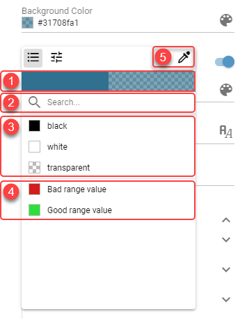
Currently selected color - In case color with transparency is selected, the transparency is visualized on the right side.
Search box - Colors can be filtered using the search box. When no search phrase is entered, all available colors are displayed. Otherwise, only colors containing the entered phrase are displayed.
Default colors - Default colors.
Theme colors - Colors defined on current theme.
Color pipette - By clicking this button, user can pick any color from the screen by simply clicking on the targeted pixel.
Figure 3: Color picker - Color editor
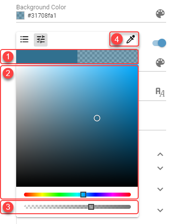
Currently selected color - In case color with transparency is selected, the transparency is visualized on the right side.
Color palette - Simply click or drag and drop to a desired color.
Transparency slider - Adjusting transparency.
Color pipette - By clicking this button, user can pick any color from the screen by simply clicking on the targeted pixel.